Here is a Prezi, with an explanation behind my ancillary texts- why I chose the design, inspiration etc...
Audience Feedback on ancillary texts and main product:
To find out what my audience thought of my ancillary texts, as well as the combination of them with my main product I did some further audience research, including a questionnaire that I handed out to 10 people to find out how effective people thought my music video campaign was (the combination of the music video, the digipak and the magazine advertisement for the digipak). Here is the questionnaire:

In this section of my audience research I wanted to have a range of ages between around 16-25 and mixed genders, as this is my target audience, so I tried my best to do this. The youngest person I asked was 16 and the oldest was 21. Overall from this area of audience research I found that the simple design of my digipak was a popular choice, with some exceptions as people thought it "needed more going on", however, the majority of people were a fan of the design. I found that people preferred the digipak to the magazine advert as they found the repeated use of the same pattern on the magazine advert made it look too busy, but overall they thought it was an effective campaign.
Although people commented at the effectiveness of the combination of the ancillary texts together, there were a few comments on how well the video and the ancillary texts linked together. Some people commented on how they noticed the link in the video title font and the font used on the ancillary texts, however, the majority did say that it was hard to establish a proper link between the video and the ancillary texts. Although there was a general agreement that they could tell the video and the ancillary texts were both meant to be 'abstract'.
Creating my main product and ancillary texts
When creating my music video campaign, I wanted all 3 of my products to link together in some way, in order for my audience to establish the relationship between the 3. In order to do this I needed to create a housestyle between the products, this included using the same:
- Fonts
- Props
- Colour schemes
- Pictures
That would then allow my audience to establish that the 3 products are related in my campaign. As the magazine advert is clearly an advert for the digipak and the digipak is featuring the music video, the link between these 3 is vital.
When it came to linking the digipak and the magazine advert, this was easy, the use of digital technologies such as Photoshop CS5 allowed me to use the same tools on the digipak and the magazine advert. For example, I used the brush tool on photoshop, and then by changing the shape of the brush to this:


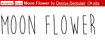 The website 'dafont.com' proved very useful in creating the house style between my two ancillary texts.

It meant that I could use both these tools, as well as the same colour scheme (I decided to go with purple and black as they went together well and I think these two colours fit in with the 'indie rock' scene).
The website 'dafont.com' proved very useful in creating the house style between my two ancillary texts.
I went on this website and used the font 'moon flower' on both my ancillary texts, and by using the same colour scheme and font it allowed me to effectively establish a link between the 2 products. I decided to chose the font because it is nice and simple, and in my initial planning and research when I looked the existing CD covers, I found that the most effective ones where the simpler ones that did not have too much detail on the front. This way it means the audience do not have too much to focus on and can focus on the name of the album and the artist, which is something that we want our audiences to remember, so that they will want to buy our products in the future.
Although I could not use this font in my video, as I could not find a way to import that font onto iMovie, I found a font that was almost very similar, so I used this for the video title of my video. I also kept the text simple on my video by putting 'Murderers' at the start of the beginning and 'Endless Daze' (the name of my artist) at the end, this meant that I have kept the design simple in both my ancillary texts and have tried to incorporate this into my music video.
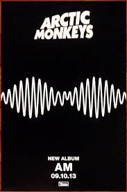
When it came to my magazine advert for the digipak I found in planning and research that many successful artists when they have a magazine advert either have a picture of the artist or just a picture of the product on their magazine. I particularly liked the Arctic Monkey's 'AM' album magazine advert, as I thought the simplicity of it was very effective.
I decided to use this magazine advert as my inspiration for my magazine advert, by following the same conventions this one kept. I liked the way it does not focus on the image of the artist like some magazine adverts from different genres (specifically pop artists) do. By just having the name of the artist and album, the date the album is out and the design of the album on the magazine advert I think this looks very effective, especially for the indie rock genre.
I decided to challenge one of the conventions by having a bit more text on my magazine advert than the typical magazine advert, but still followed the convention of keeping the rest of the advert fairly simple. As you can see I featured the name of the artist and album, the date it is released and then a picture of the album (this is helpful for audiences because it means they know what to look out for). Because the design is simple yet unique to my artist, it has helped in the development of creating the new identity for my artist.
No comments:
Post a Comment